Astigmatism Factor – Aperture Sharpness
(See Chart Features for general chart features - changing scales, copying to clipboard etc)
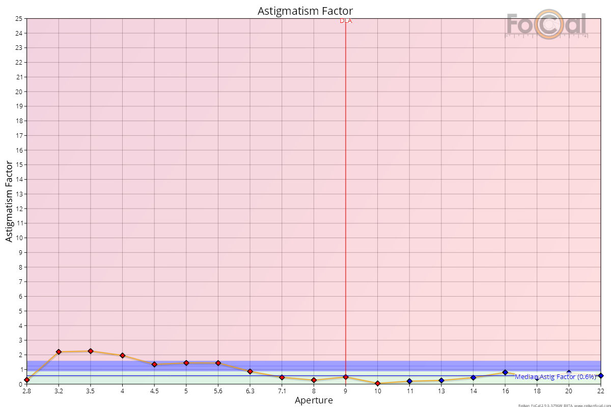
The Astigmatism Factor chart shows the image quality ratio between the horizontal and vertical analysis directions.
Key:
- Red diamond: a point where the horizontal axis is sharper than the vertical axis
- Blue diamond: a point where the vertical axis is sharper than the horizontal axis
- Blue Line: median (average) astigmatism factor
Where FoCal Comparison Data is available, the horizontal coloured bands indicate how this lens compares to other lenses of the same type on the same camera model:
- Green area - above average performance
- Blue area - average performance
- Red area - below average performance
Basic Interpretation
The Astigmatism Factor is an absolute indication of the difference between the horizontal and vertical sharpness. This means that a difference in either direction will increase the Astigmatism Factor value (height vertically on the chart). In order to determine the sharpest axis, the points are coloured as shown in the key above.
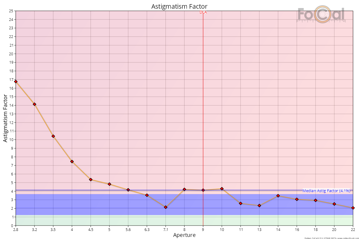
Some increase in Astigmatism Factor is not unusual as the lens opens wider, especially for fast (large aperture) lenses.
Vibration
Astigmatism Factor can also indicate that the camera is experiencing high levels of vibration during a test. This is typically shown by a high value (>5%) of Astigmatism Factor at some points but not necessarily all of them. Typically, the points will show as red diamonds if vibration is the cause - this means the blurring is in the vertical axis which is what you would usually expect from a vibrating setup.
Further Details
FoCal Comparison Data Interpretation
The chart above also shows FoCal Comparison Data results (the horizontal red, blue and green areas). In the example above the lens is performing perfectly within the blue area meaning it is giving good, appropriate sharpness across the aperture range as compared to other users.
You should not expect the lens profile to fit perfectly within the blue area - most of the time it will take on a shape roughly representative of the blue section. The example above is particularly good in that the red line almost entirely fits within the blue area.
You should take note if the red line is significantly below the blue area for most of the chart. The ADS Difference chart gives another way of visualising this.
Unusual Results – a damaged lens
The following chart shows an example of a chart from a high quality lens (Canon EF24-70mm f/2.8L) which has been damaged by impact and shows poor sharpness when wide open. The key thing to note is the large rise in astigmatism factor as the aperture is opened close to f/2.8:
At f/2.8, a crop of the target looks quite poor, even for a relatively fast lens like this:

Compared to the results at f/8, you can clearly see the difference!

Lens Profile – Aperture Sharpness | This Page | Red-Blue Ratio – Aperture Sharpness