Quality of Focus – Focus Consistency
(See Chart Features for general chart features - changing scales, copying to clipboard etc)
The Quality of Focus chart shows the absolute sharpness value for each of the points through the test.
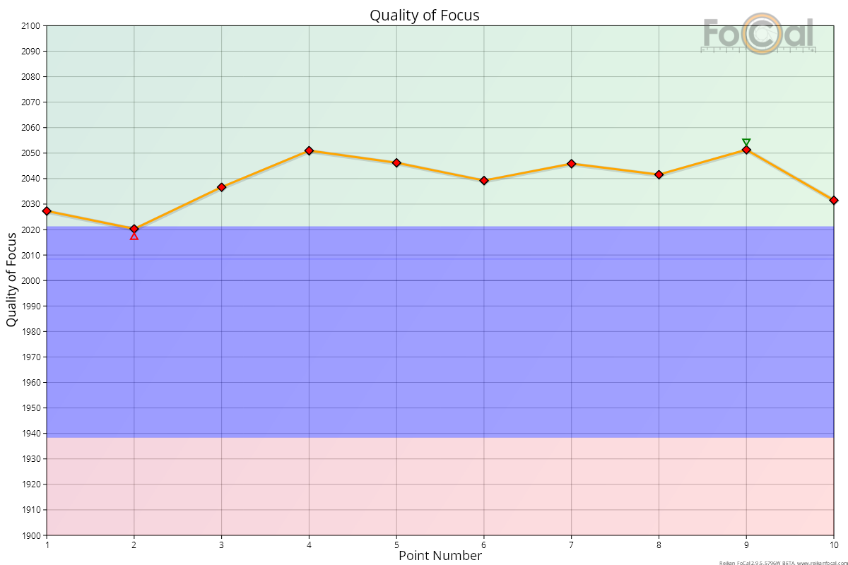
Key:
- Red diamond: unoptimised sharpness (Target Optimisation disabled)
- Green diamond: optimised sharpness (Target Optimisation enabled)
- Orange line – the sharpness value across the test
- Green triangle - indicates the highest value
- Red triangle - indicates the lowest value
Where FoCal Comparison Data is available, the horizontal coloured bands indicate how this lens compares to other lenses of the same type on the same camera model:
- Green area - above average performance
- Blue area - average performance
- Red area - below average performance
Basic Interpretation
A higher value on the Y axis (Quality of Focus) indicates a sharper captured image at this point. With good test conditions (solid tripod, stable lighting etc), a good quality lens operating correctly on a well-functioning camera will result in a consistent set of results with a variation of the order of a few 10’s of QoF points as shown in the example above. The overall result for this test was 99.4% CoF (Consistency of Focus) which is a very respectable result.
NOTE: It is important to realise that the results of this test are influenced by the AF Microadjustment / Fine Tune of the camera. If the AF system is correctly calibrated you will see the best possible results during the Focus Consistency test. If your lens is NOT calibrated, the results will be lower and this can be a sign that you need to calibrate. It is always worth running this test after you have performed a calibration.
Note also that this chart is scaled to fill the vertical area of the chart, so it’s important to look at the numerical values of the Quality of Focus scale in order to determine the differences between the values. The chart line can look like it is varying a lot (as in the example above), but in reality it’s only changing by fractions of a percentage point.
Further Details
FoCal Comparison Data Interpretation
The horizontal red, blue and green bands of the FoCal Comparison Data allow you to see how your lens is performing compared to the average values of other users of the same camera/lens combination.
The example above shows a well calibrated lens producing results in the green area – i.e. that are better than the majority of other users.
This Page | Results Progression – Focus Consistency