Comparison Data Difference – Aperture Sharpness
(See Chart Features for general chart features - changing scales, copying to clipboard etc)
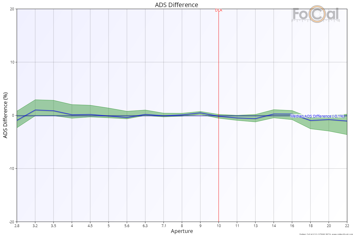
The Comparison Data Difference (ADS Difference) chart shows the point-by-point difference between the data captured from your camera and lens and the processed data from many FoCal users. Note that this chart is only populated when there is FoCal Comparison Data available for this camera/lens combination.
Key:
- Blue line – the difference between the measured sharpness and the average user sharpness
- Green area – the extent of typical “normal” sharpness values.
- Thin blue horizontal line – median difference of all measured points
- Vertical red line - diffraction limit
Where FoCal Comparison Data is available, the horizontal coloured bands indicate how this lens compares to other lenses of the same type on the same camera model:
Basic Interpretation
The blue line indicates the difference between your data and the median value of other users. Any point this blue line is higher than 0 indicates that your lens is sharper than the calculated “mid” average of all lenses.
The green area indicates the upper and lower limits of the difference between your data and the majority of typical lenses, and this is a better indication of how your lens is behaving. At any particular aperture, if the complete green area is above 0 then your lens is performing better than any typical lens at that aperture. Conversely, if the green area is completely below the 0 line, then your lens is behaving worse at that aperture.
It's generally useful to look at the whole range of the chart when considering whether the lens is typical or not. A few points below 0 is not a major issue and could just be the result of testing variations (you can always repeat the test to see if the results look the same). The median line summarises the difference across the whole range - a large variation or a median variation significantly away from the zero may indicate that your lens is not performing in the same way as a typical lens.
Where possible, the chart will include a red vertical marker at the Diffraction Limited Aperture (DLA) to indicate where diffraction will start to affect the sharpness of the image.
The left hand side of the chart represents the sharpness of the lens with the aperture wide open (in the example above this is f/2.8). As you progress across the chart to the right, the aperture is closing down in size, represented by the larger f-number (through to f/22 in the example above).
The shape of the chart above is fairly typical for a lens that does not have a super-wide aperture (e.g. < f/1.8). The best sharpness is usually around f/5.6-f/8, with either a slight drop or a fairly stable level between here and wide open.
The vertical red line indicates the point where diffraction will start to soften the image and you will see a drop with almost every lens from around this point to the right side of the chart (the smallest aperture).
Further Details
The above example shows a lens that performs very similarly to the typical user lens performance. Below is an example of a lens which exhibits issues as it opens wide towards f/2.8:
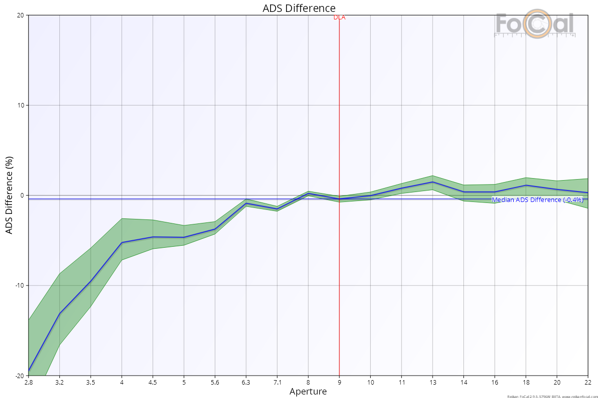
It’s clear to see a significant drop in the line, showing that the measured sharpness at these larger apertures (close to f/2.8) is much lower than the typical behaviour for this lens. Combined with information on the Lens Profile and Astigmatism Factor charts, this would show a picture of a significantly underperforming lens that requires further investigation.
Red-Blue Ratio – Aperture Sharpness | This Page | Image Motion – Aperture Sharpness