Red-Blue Quality – AF Consistency
(See Chart Features for general chart features - changing scales, copying to clipboard etc)
What this shows
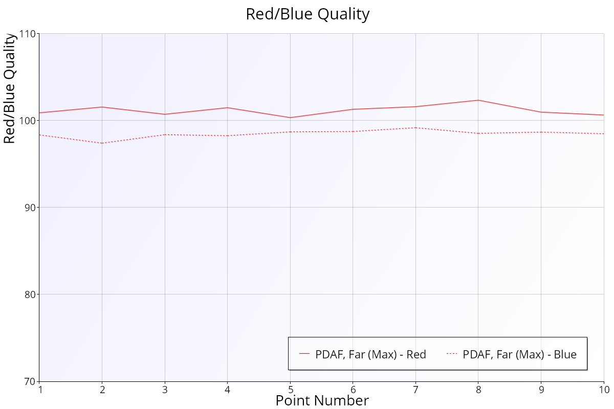
The Red/Blue Quality chart compares the sharpness of the red and blue colour channels with the green channel, for each shot.
How to read it
- X axis: the point number through the test.
- Y axis: red or blue quality as a percentage of green quality, from 70% to 110%.
- 100%: the channel is as sharp as green.
- Above 100%: the channel is sharper than green.
- Below 100%: the channel is less sharp than green.
- Solid line: red compared with green (R/G).
- Dashed line: blue compared with green (B/G).
- Each data set (autofocus type and defocus) has its own colour. The legend names each line, for example "PDAF, Far (Max) - Red" and "PDAF, Far (Max) - Blue".
Most autofocus systems aim to get the green channel in focus, as our eyes are most sensitive to green. Comparing red and blue with green removes the normal shot-to-shot change in overall sharpness, so the two colours can be compared directly. The chart doesn't show how sharp the image is overall.
What good looks like
Both lines are steady and close to 100%. No lens focuses every colour to exactly the same point, so a small, steady gap is normal. Lenses with special low-dispersion elements (for example aspherical or fluorite) usually show a smaller gap.
If it looks wrong
- One line well below 100%: that colour is noticeably less sharp than green, which shows as chromatic aberration (colour fringing) on high-contrast edges. This is a property of the lens design, not something calibration fixes.
- Lines jumping around from shot to shot: focus is landing in different places. Check the Quality of Focus – AF Consistency chart and the setup.
- Unexpected values with JPEG: the camera's processing mixes the colour channels, so the figures are only approximate. Test in Raw mode for accurate colour results.