Red-Blue Ratio – MultiTest
On this page
(See Chart Features for general chart features - changing scales, copying to clipboard etc)
What this shows
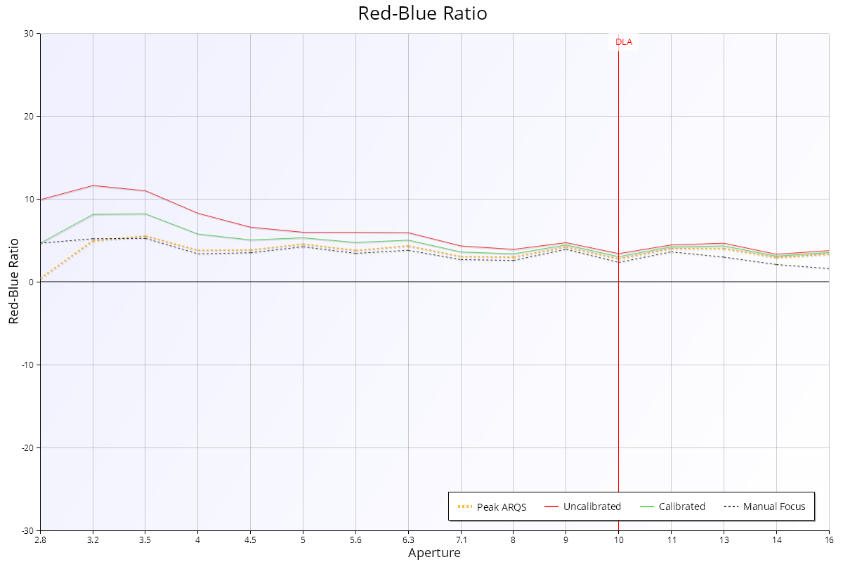
The Red-Blue Ratio chart compares the sharpness of the red and blue colour channels at each aperture. A large difference is a sign of chromatic aberration (colour fringing).
How to read it
- X axis: aperture, from wide open on the left.
- Y axis: Red-Blue Ratio, from -30% to +30%. 0% means red and blue are equally sharp. Above 0%, red is sharper. Below 0%, blue is sharper.
- Red line ("Uncalibrated"): Red-Blue Ratio with the focus adjustment at 0. In Live View mode this line is called "Wide Open" (focused wide open, then stopped down).
- Green line ("Calibrated"): Red-Blue Ratio with the lens calibrated for best focus wide open.
- Orange dashed line ("Peak ARQS"): Red-Blue Ratio at the focus adjustment with the best average quality across all apertures (see Aperture Range Quality Score (ARQS) – MultiTest).
- Black dashed line ("Manual Focus"): Red-Blue Ratio when focused perfectly at each aperture.
- "DLA" marker: the diffraction limited aperture for this camera.
The Calibrated and Peak ARQS lines are only shown when the test uses camera focus adjustment.
What good looks like
The lines stay close to 0%. No lens focuses every colour to exactly the same point, so a small, steady offset is normal. Larger differences wide open are common with fast lenses. The chart doesn't show how sharp the image is overall.
If it looks wrong
- Large values that repeat: the lens shows strong chromatic aberration at this distance. You may see colour fringing on high-contrast edges. This is a property of the lens design, not something calibration fixes.
- Unexpected values: check the target is lit with roughly white light (see Spectral Info on the Details - MultiTest page). With JPEG, the camera's processing mixes the colour channels, so test in Raw mode for accurate colour results.
Further details
Why colours focus differently
To focus perfectly, light of every colour must meet at the same point on the sensor. Real lenses bend each colour by a slightly different amount. Imagine a white point of light where green is perfectly focused, but red focuses slightly in front of the sensor and blue slightly behind. You get a sharp green point with a slightly blurred red and blue halo, which shows as a purple fringe. This is called axial (or longitudinal) chromatic aberration.
Lenses are usually designed to focus green correctly, as it is in the middle of the visible spectrum. Comparing red with blue shows whether the lens is likely to produce colour fringing. Lenses with special low-dispersion elements (for example aspherical or fluorite) usually do better.