Quality Grid – MultiTest
(See Chart Features for general chart features - changing scales, copying to clipboard etc)
What this shows
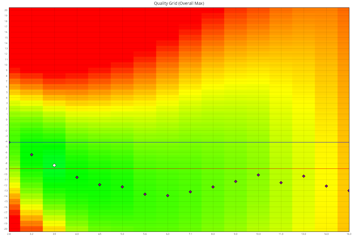
The Quality Grid is a map of image quality across every aperture and focus position MultiTest measured. It shows where the lens is sharpest, how the best focus position moves as you stop down (focus shift), and which focus adjustment gives the best results. With enough data, it is the chart on the Summary tab.
How to read it
- X axis: aperture, from wide open on the left to the narrowest tested aperture on the right.
- Y axis: focus position. With Use Camera Focus Adjustment on, this is in AF Microadjustment / AF Fine Tune units. In Live View mode it is in focus offset units (see MultiTest (Live View)).
- Colour: quality, from red (worst) through orange and yellow to green (best). Anything below 80% of the peak quality shows as red.
- Purple diamonds: the best focus position at each aperture.
- Black curve: the path of the purple diamonds, smoothed. Its slope shows the focus shift of the lens.
- White diamond: the single best point of the whole test (aperture and focus position).
- Blue line: the best focus position wide open. This is the "classic" calibration value.
- Red line: the focus position with the best Aperture Range Quality Score (ARQS), which gives the best average quality across all apertures (see Aperture Range Quality Score (ARQS) – MultiTest). Only shown when the test uses camera focus adjustment.
There are two versions of the chart:
- Quality Grid (Overall Max): colours are relative to the best point of the whole test. Green means close to the best quality the lens achieved at any aperture.
- Quality Grid (Aperture Max): colours are relative to the best point at each aperture. Each column runs from red to green, so you can see the best focus position at every aperture, even where quality is lower overall.
What good looks like
- At the widest aperture (the left-hand column), the greenest point is close to the blue line. That is the calibration result.
- The purple diamonds form a smooth line that stays close to the blue line as you stop down. A sloping line shows focus shift: the best focus moves as the aperture changes. Some focus shift is normal, especially for fast lenses.
- In the Overall Max view the widest aperture is usually not fully green, because most lenses are sharper stopped down.
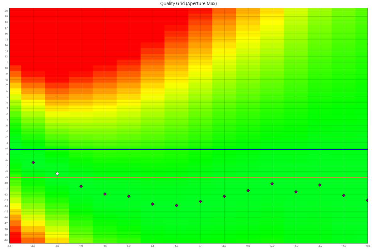
The second example above is the Aperture Max view of the same test. Every column now spans red to green. The white diamond, the sharpest point of the test, is at f/3.5 with the focus shifted by -8 AF Microadjustment units from the wide-open autofocus result.
If it looks wrong
- Patchy colours or diamonds that jump around: some measurements were unreliable. Check the setup (solid tripod, steady and bright light, nothing moved) and run the test again.
- The greenest point at the widest aperture is far from 0: the lens needs calibrating. See Best Wide on the Details - MultiTest page, or run a Focus Calibration.
- Strong focus shift: if you often shoot stopped down, consider the ARQS value (red line) as a compromise calibration. See Aperture Range Quality Score (ARQS) – MultiTest.